In Win have been making a name for themselves recently with a bunch of very different and very cool looking cases. Before we get into the bad news, let’s start off with the good stuff. Last year we had the D-Frame, and the S-Frame. This year the S-Frame was here again, but with gold accents and a brushed black aluminum frame:
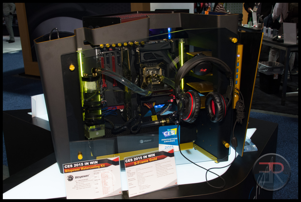 The case is very expensive, and is designed to be wall mounted as a piece of art. It’s made out of a single thick piece of Aluminum which has to be bent by hand which is partly why the cost is over $700.
While the case is a piece of art, it’s not that functional, supporting only one 360 which is disappointing for a case that costs so much and can support so many GPUs. However there is no denying the sexy factor. After seeing the positive response to this case, In Win took the idea behind it and built it into a more practical case called the S-Box:
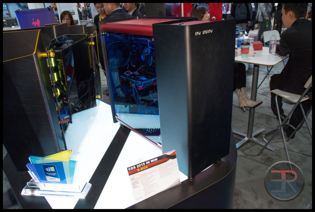 This one fits a more standard use model, and does not require hand bending but retains the style. It’s sort of like the transition from the concept car you might see at the auto show to the real model years later. 360 up top of course.
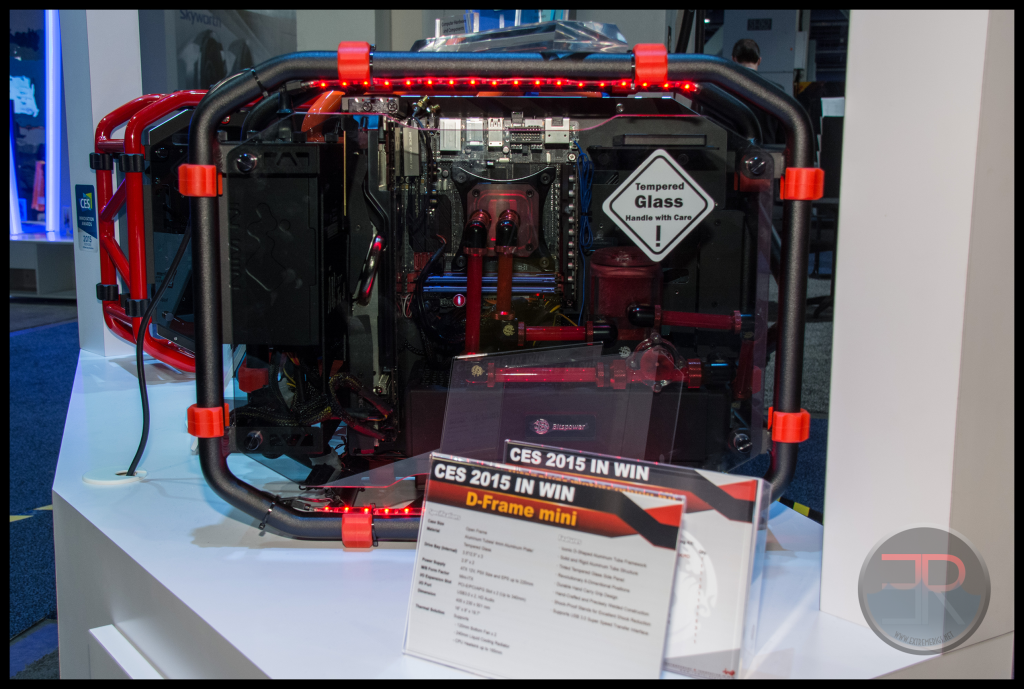
We also got to see the D-Frame Mini which is just a smaller version of the D-Frame for mITX:
 However after all these unique cases and innovation in style, we were then surprised to see this:
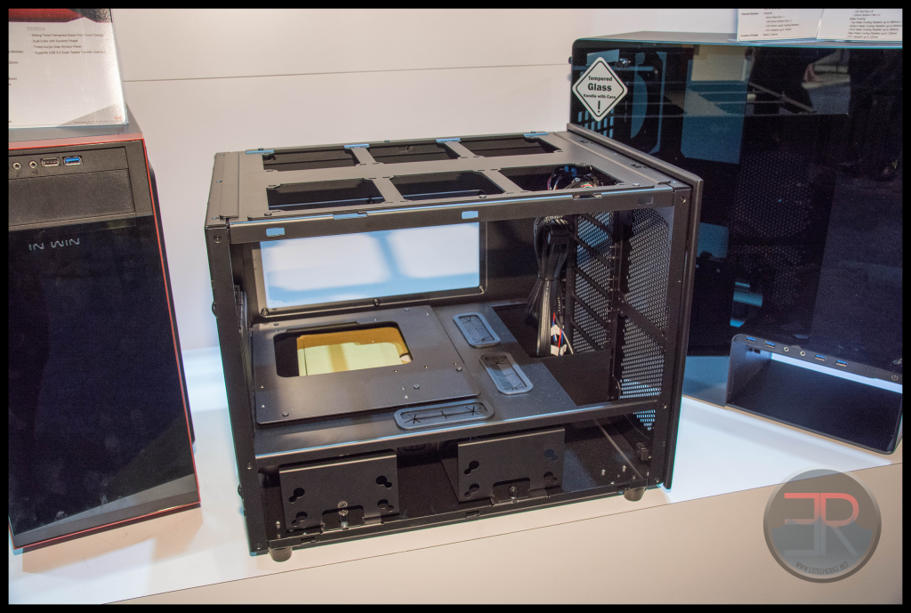
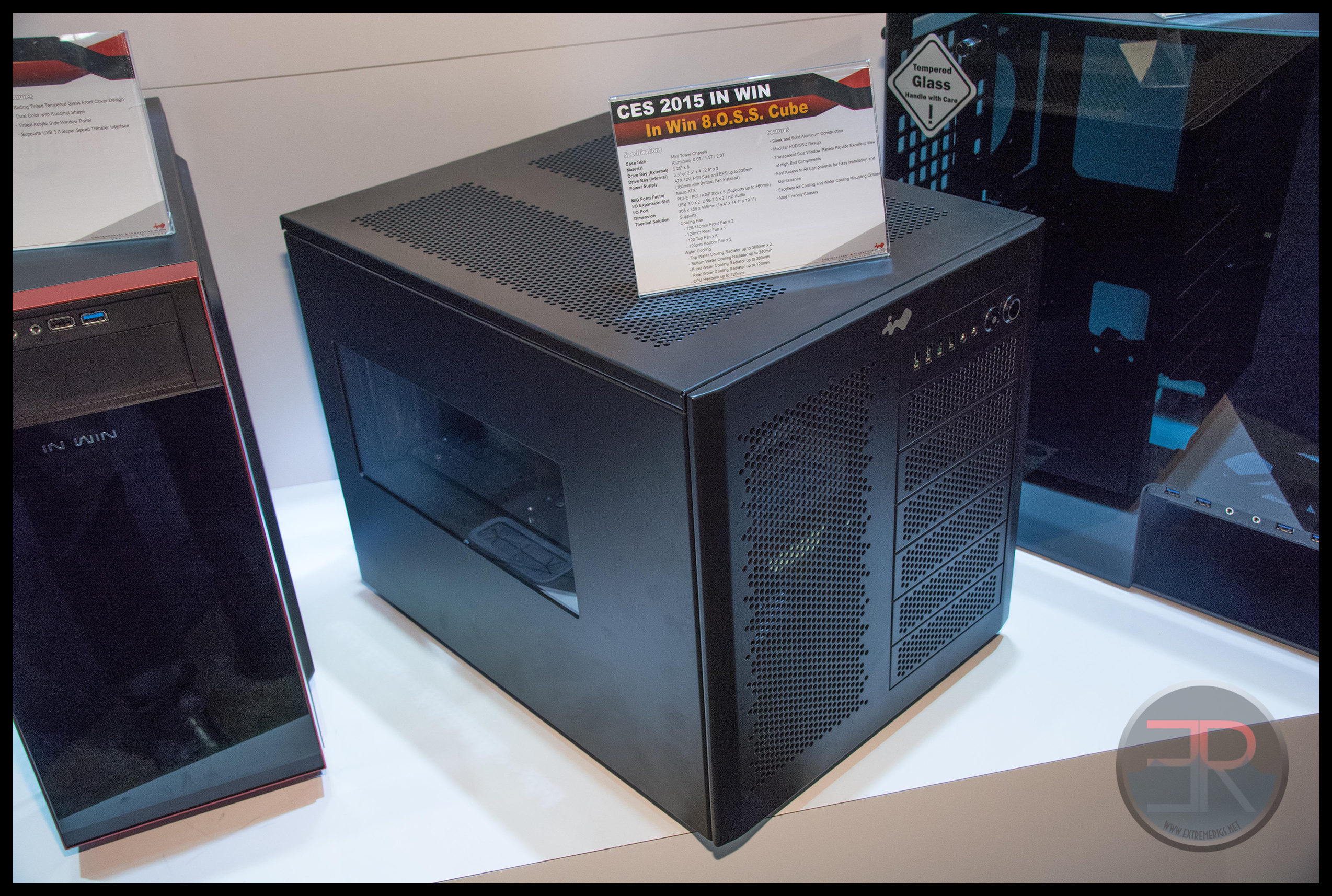
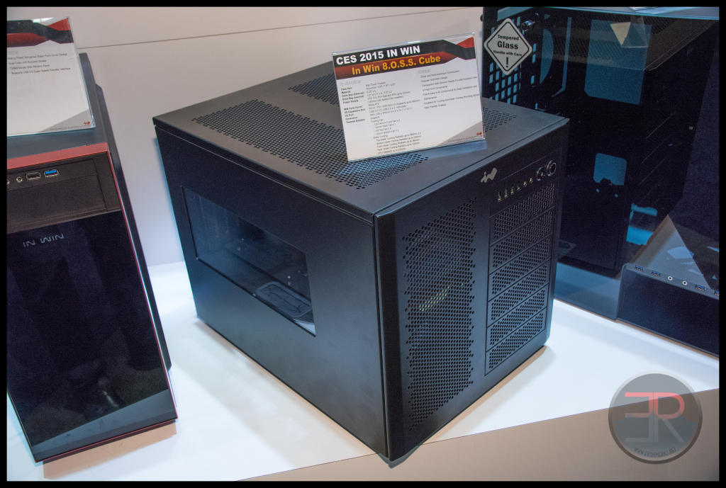 The In Win “8.0.S.S. Cube” was tucked away round the side of the booth with the “cases of lesser interest”. We instantly recognized it as being extremely similar to the CaseLabs S5/S8/S8s. Now of course the layout isn’t identical to the S5 or S8. It’s more like the S8 short, but with only a S5 motherboard tray fitted. Let’s take a look at the feature set:
– removable clip on panels made of perforated or windowed aluminum
– mATX horizontal motherboard tray with 5 slot support and that is removable with 4 screws
– 2×360 radiators supported up top with a “drop-in” mount
– “Flexible drive bays” on the right of the front panel, with a 240 radiator mount on the left
– Side windows with pressed studs secured by nuts to give a clean look
– bottom chamber with easily removable HDD/SSD mounts on the left, separated from the PSU on the right
All of these are features that are either on the S5 or S8, and were sometimes exclusive to them. Now of course the basic ideas, such as a horizontal motherboard isn’t new. Nor do we expect every case to be totally original. Since Bitfenix’s Prodigy case the style of a horizontal board with a PSU underneath has been gaining popularity again with a huge amount of cases launched these past few years in this style and it would be impossible for every case to be 100% an entirely new idea.
However CaseLabs brought some of their individual ideas and original designs to the table when they launched the Mercury s3/5/8 range. This In Win case is so close to the CaseLabs line up in style that when I saw it I did a double take. Now there is a huge grey area between copying and being inspired or influenced by something. After all cases need things like places to put a motherboard or a radiator. Corsair’s 900D obviously was influenced by the design of the TJ07, the 800D and the SMH10, but it’s also clearly it’s own design. This case is not clearly it’s own design.
Here’s what we learned from the InWin rep:
– it’s available for now only in the UK throught OverClockers.co.uk
– it was specfically requested by OCUK and designed to their specifications
– it was only built because of the purchase order from OCUK
OCUK also sells CaseLabs cases, including the S5, preconfigured with hardware. So not only is their similarity in design, but there is a possible motivation for OCUK to lower their costs while adding more cooling to the S5 design.
So let’s take a look at the design:
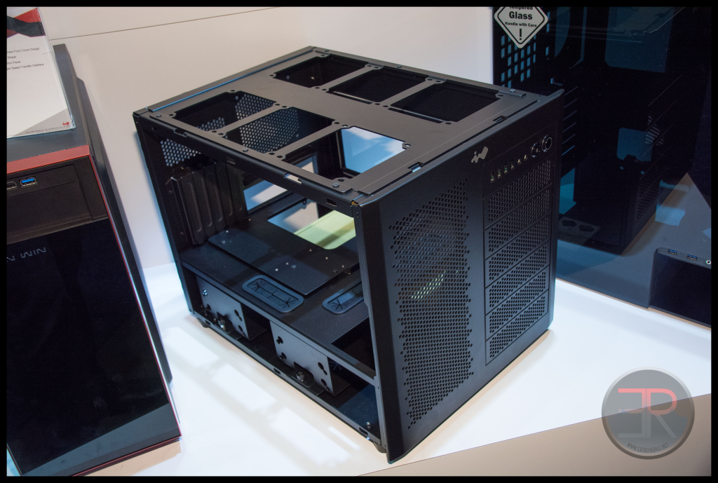 Removing the clip on top and side panels reveals the dual 360 radiator mount on top. This is a drop in mount secured by 6 screws. Note how the drop in mount is bent and dropped down around the edges so it centers with the internal frame. Now I don’t have an S5 in house to compare, but I do have an S8 which we reviewed earlier in the year.
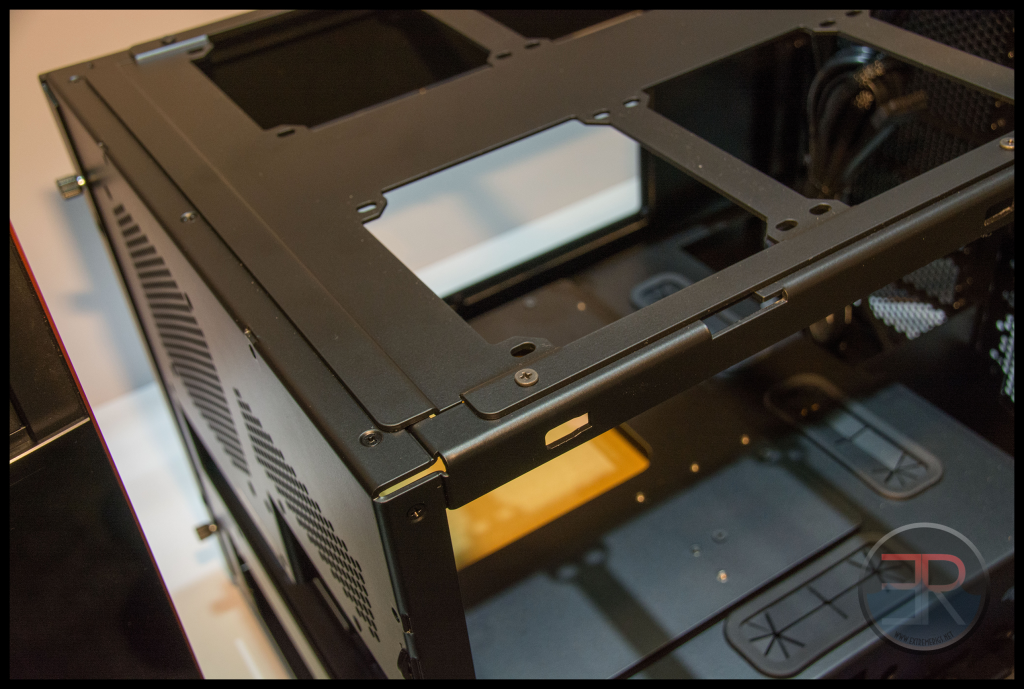
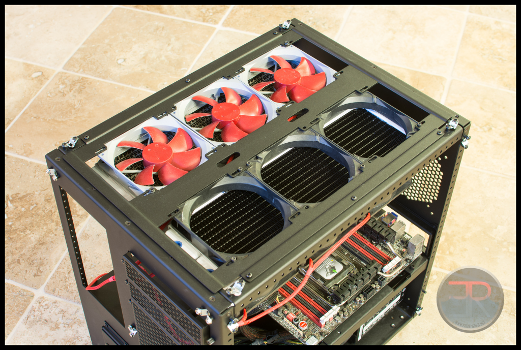 Look closely at the two drop in mounts and it looks familiar… Here’s a zoom of that In Win version:
Now let’s compare the HDD cage area:
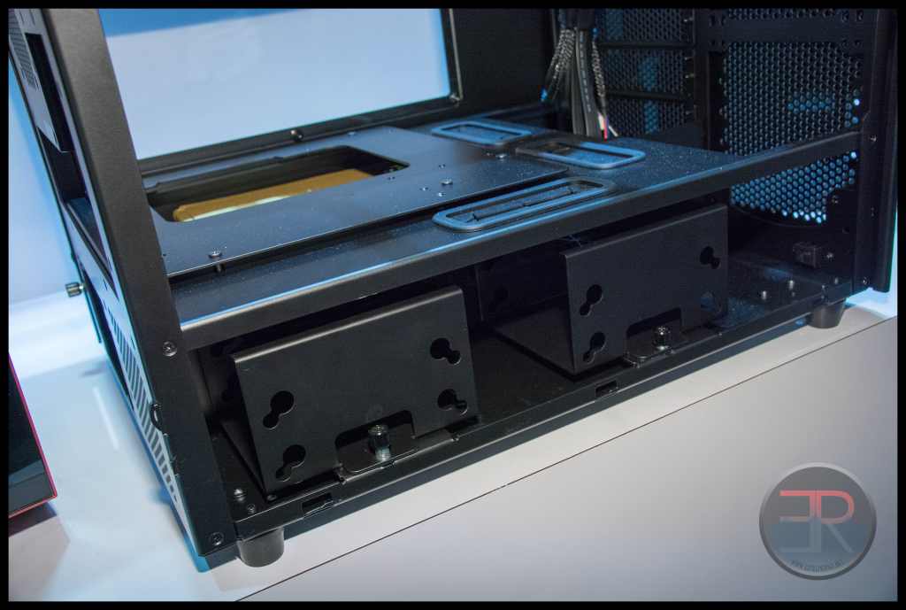 Oh look – each one can have two banks of HDD cages with easily removable mounts:
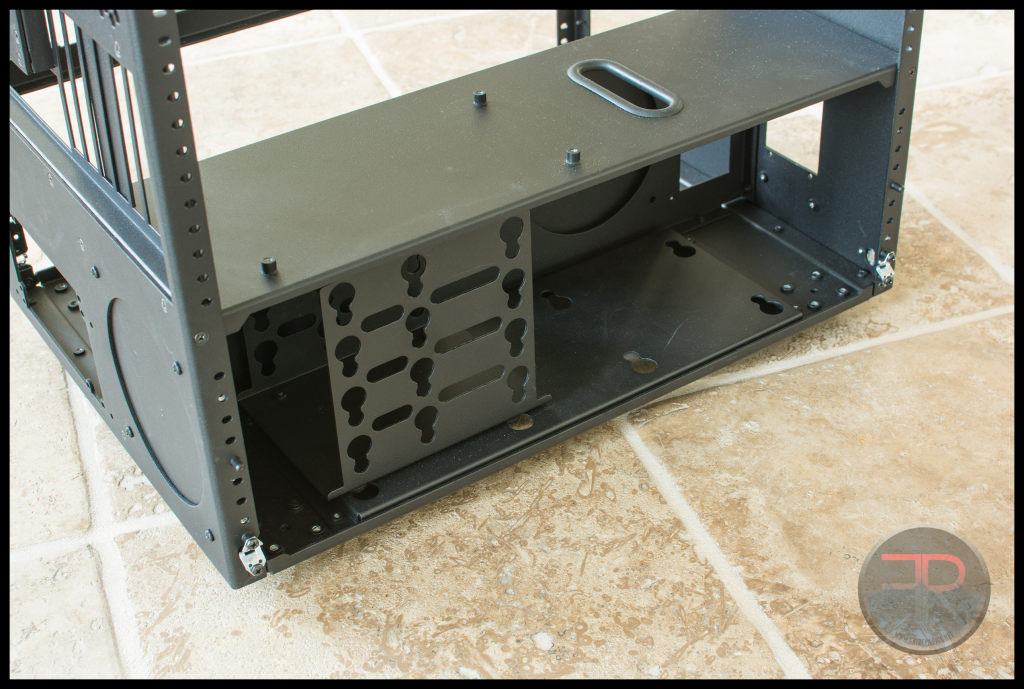 On it’s own that would not be a big deal. However let’s take a look at that motherboard tray:
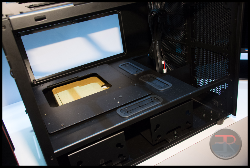 Note that you can even see they’ve kept the same bolt pattern for using casters – even though it’s not an option and they fit feet to the case instead. This is a sure sign that parts of the case were copied verbatim because the designer didn’t understand what was relevant and what was not.
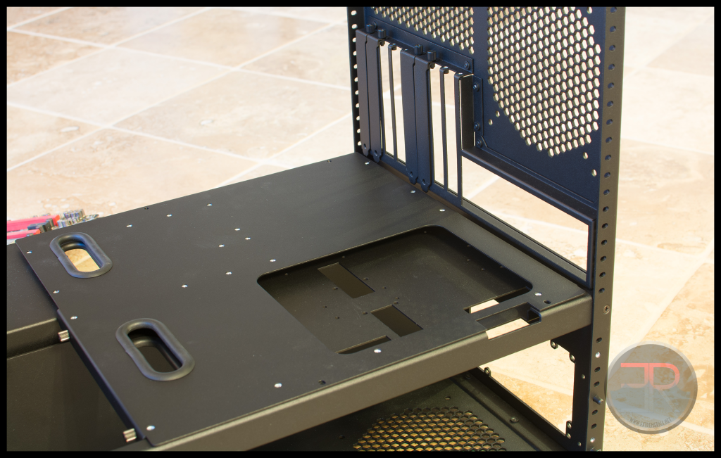
The S8 of course has a much bigger tray – but you’ll note how there are screw holes at the edge of the tray on both so that the tray can be removed without taking the motherboard off of it:
 Here’s a better shot from the CaseLabs website of an S5 tray:
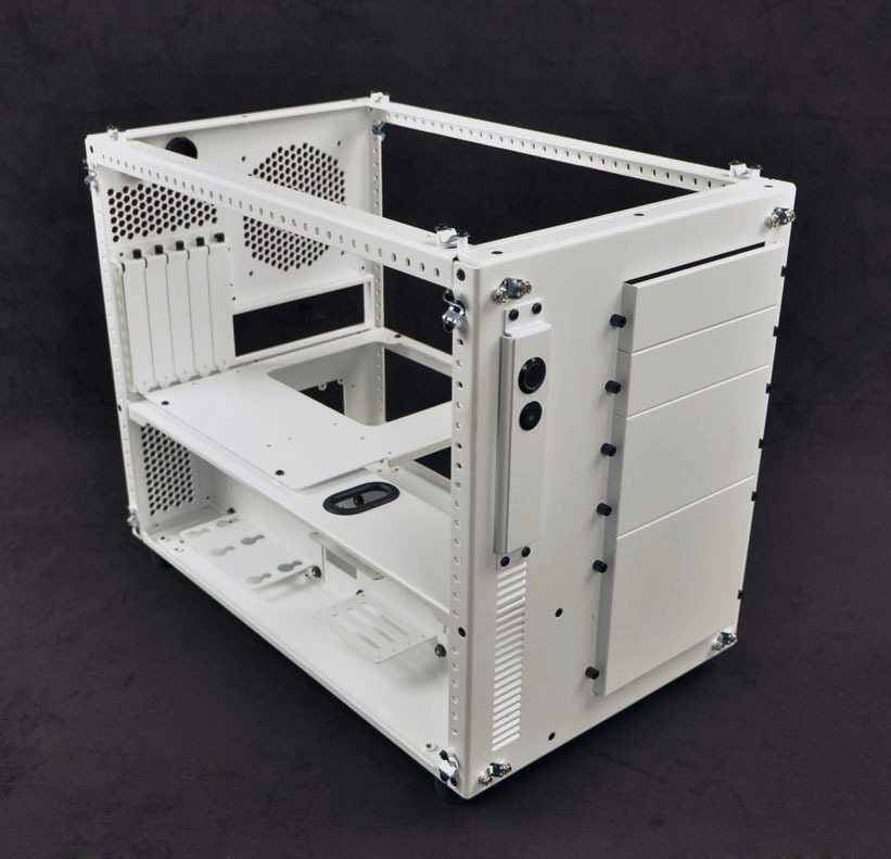 Does that look familiar?
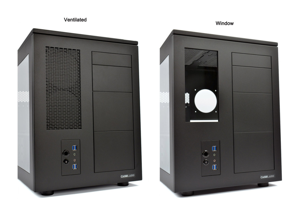
How about being able to mount a 240 to the front panel?
 Just like this (left hand version – behind the mesh is a 240 mount) – Pic courtesy again of the CL website:
Or let’s take another look at the drive bays on the 8.O.S.S – most cases with drive bays have an actual mount so you can put an optical drive or reservoir or something in there. CaseLabs does not but instead has a flexbay system that I’ve never seen from anyone else. Well guess what – there it is on the 8.O.S.S:
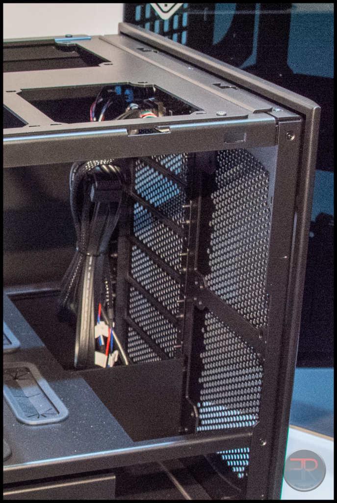
It even usese the same system, with a peg and them a thumbscrew to secure each bay cover. Compare to the CaseLabs:
 The 8.O.S.S. is going to need the same exact accessories in order to mount anything from optical drives or radiators or fan controllers to the chassis. It will be interesting to see if they are so close that they are interchangable.
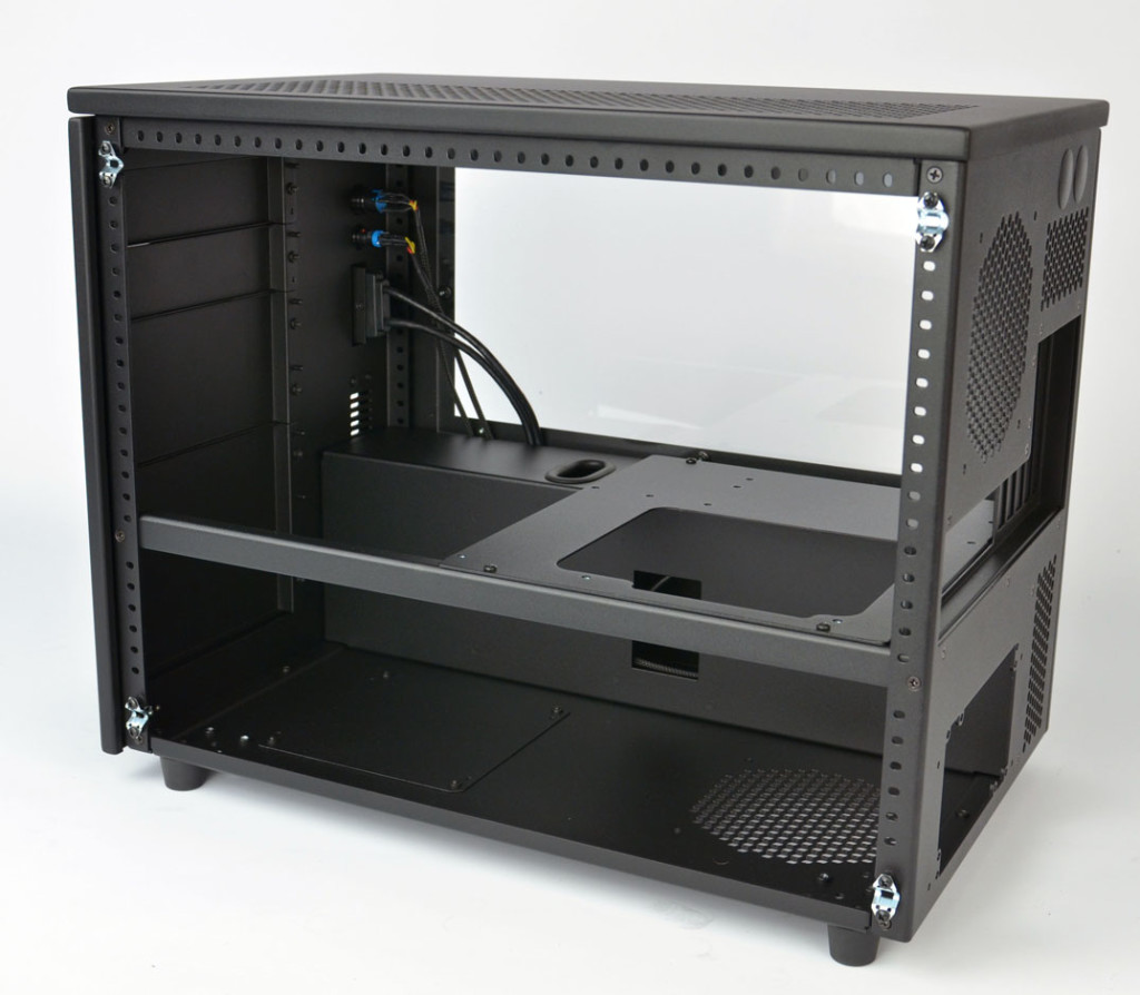
Now let’s compare the window:
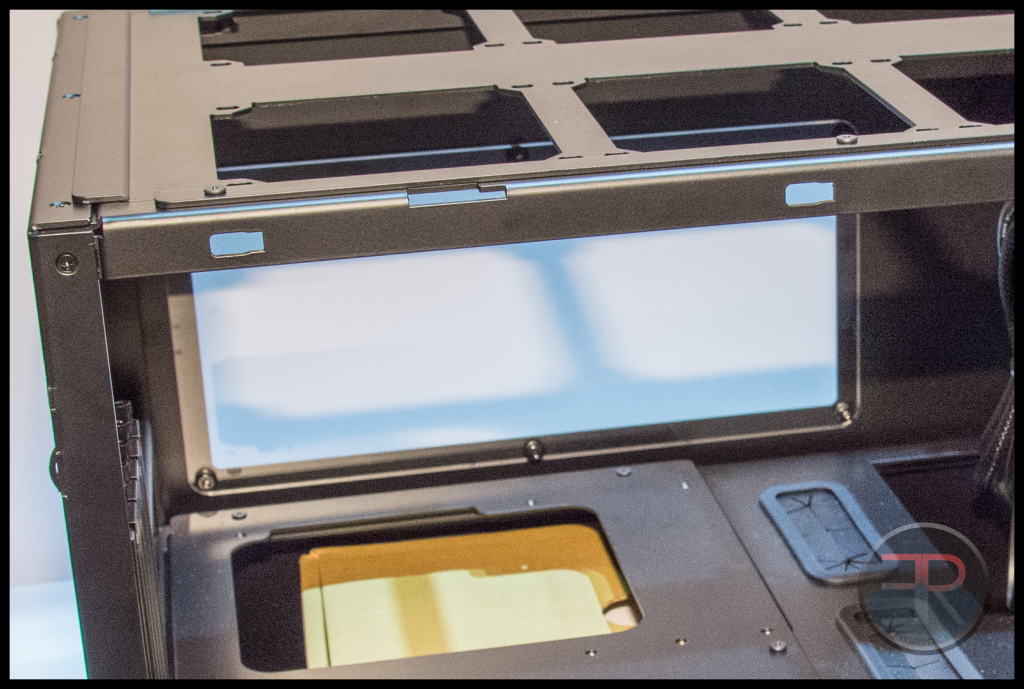
vs the CaseLabs – does the mount system look at all similar? (pic stolen from CL website)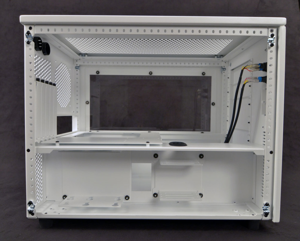 Even if you look at the frame construction – most of the pieces are used and shaped in the same way and are drilled in the same relative position for screws.
This is beyond “inspiration” because it’s far easier to list what is different than what is similar:
– The 8.O.S.S. is wider than the S5, and shorter than the S8
– It’s power/reset/audio i/o are located in a flexbay rather than in the lower left chamber
– There’s an extra cable routing hole next to the GPU end of the motherboard
That’s about all I can come up with that is different. Bear in mind my comparison photos were not even taken in order to prove the similarity. If I had both in house I’m sure I could make an even stronger argument along these lines.
Individually each thing could be excused, but the sum of the whole makes it hard to argue that this isn’t just mildly inspired by CaseLabs. I have to say that I expected better from In Win.
So enough of that distasteful subject and on to the rest of In Win’s offerings:
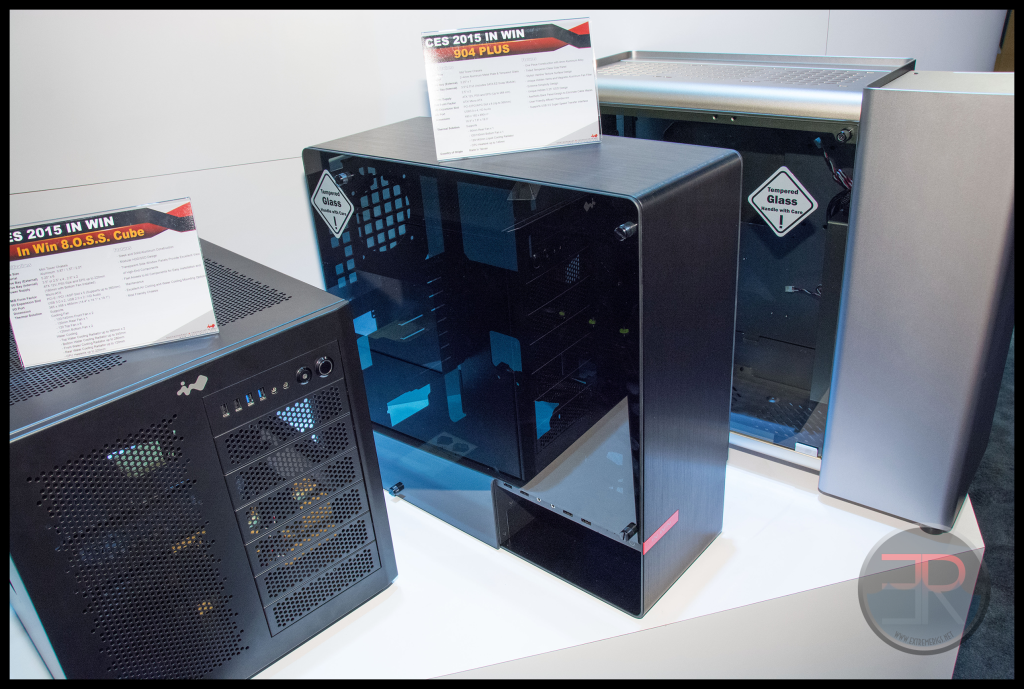
The 904 got a slight improvement and has become the 904 plus. This case is one I like. You can also see another S Box in the background in silver.
We also saw some lower end cases like this one with a sliding front panel:
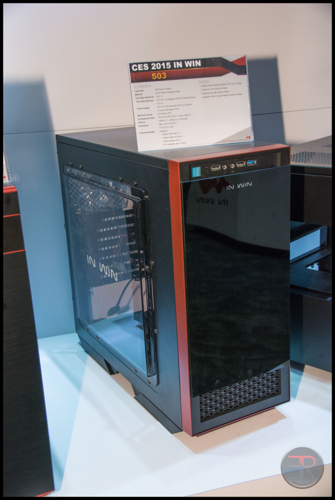 This one with an ugly 360 mount up top and a door that opens to allow access to 3x 5 1/4″ bays:
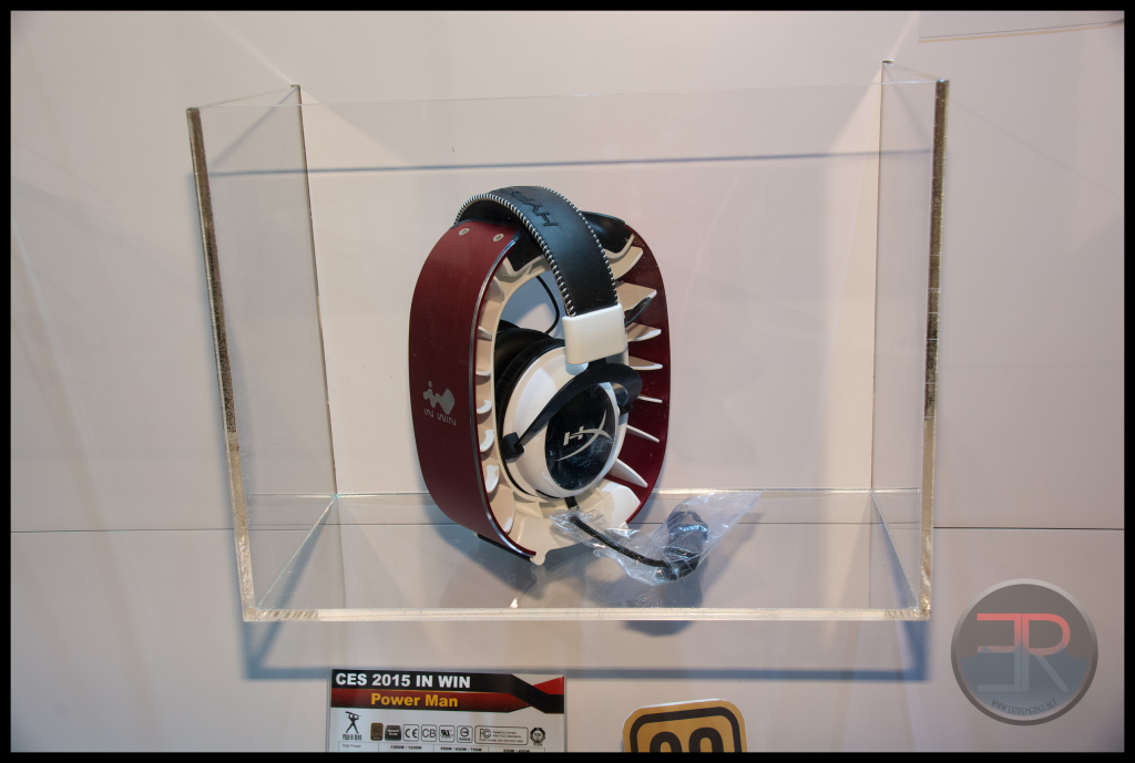
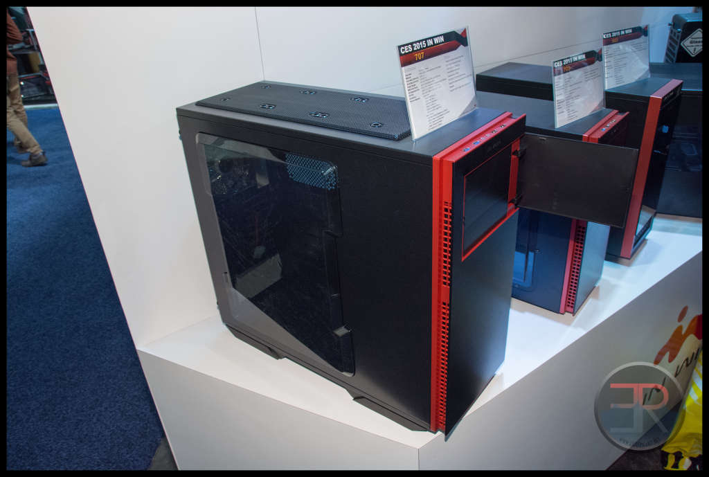 There were also some accessories including a headphone stand:
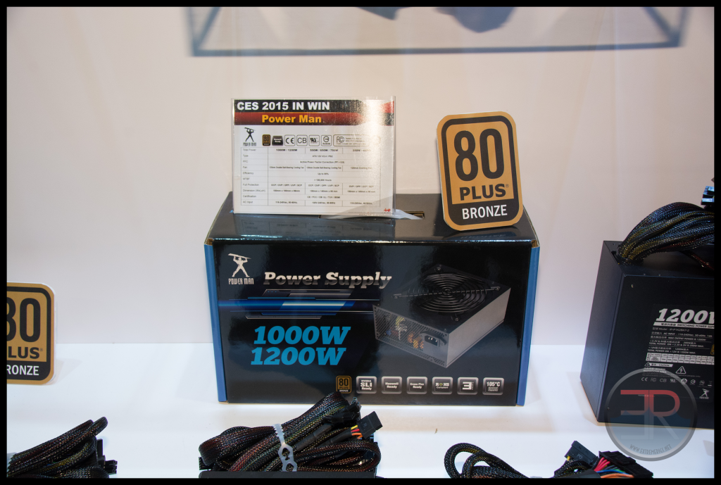
 As well as an power supply that was not only bronze, but didn’t use black wires:
After last year we expected more great innovative things from In Win. To say we were disappointed by them at this year’s show was an understatement.




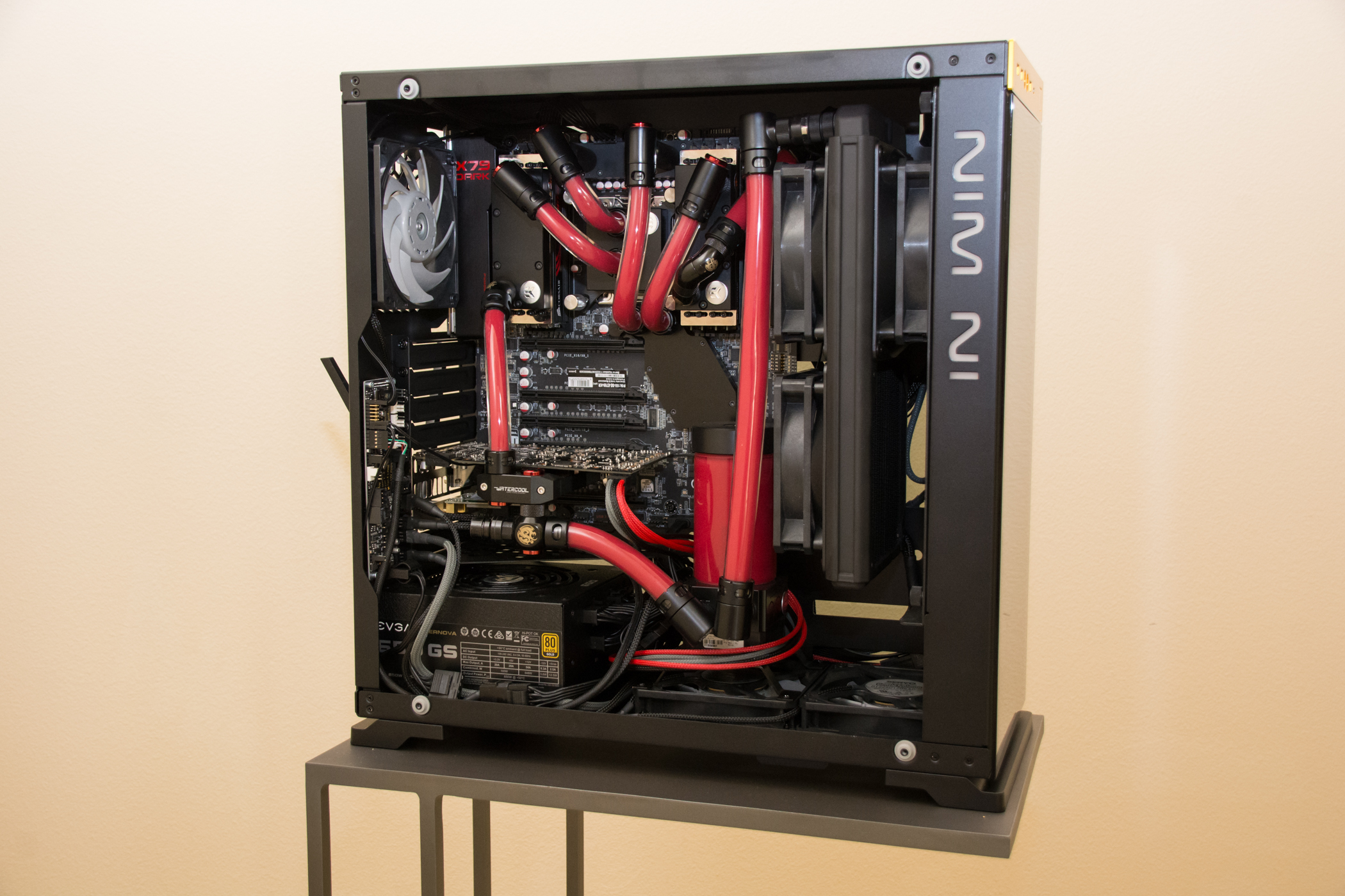

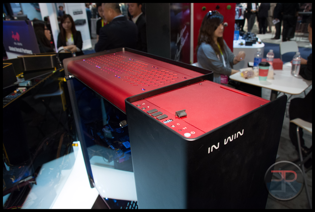

The other S Box (next to the 901 and 904) is “titanium” not silver. It isn’t slated for production . . .
The red/black S Box should be available sometime in Q2.
[…] […]
Comments are closed.